Chapter 1 - Introduction (Python Code)#
! pip install --upgrade quantecon_book_networks kaleido
Show code cell output
Requirement already satisfied: quantecon_book_networks in /usr/share/miniconda3/envs/networks/lib/python3.11/site-packages (1.1)
Requirement already satisfied: kaleido in /usr/share/miniconda3/envs/networks/lib/python3.11/site-packages (0.2.1)
Requirement already satisfied: numpy in /usr/share/miniconda3/envs/networks/lib/python3.11/site-packages (from quantecon_book_networks) (1.24.3)
Requirement already satisfied: scipy in /usr/share/miniconda3/envs/networks/lib/python3.11/site-packages (from quantecon_book_networks) (1.11.1)
Requirement already satisfied: pandas in /usr/share/miniconda3/envs/networks/lib/python3.11/site-packages (from quantecon_book_networks) (2.0.3)
Requirement already satisfied: matplotlib in /usr/share/miniconda3/envs/networks/lib/python3.11/site-packages (from quantecon_book_networks) (3.7.2)
Requirement already satisfied: pandas-datareader in /usr/share/miniconda3/envs/networks/lib/python3.11/site-packages (from quantecon_book_networks) (0.10.0)
Requirement already satisfied: networkx in /usr/share/miniconda3/envs/networks/lib/python3.11/site-packages (from quantecon_book_networks) (3.1)
Requirement already satisfied: quantecon in /usr/share/miniconda3/envs/networks/lib/python3.11/site-packages (from quantecon_book_networks) (0.7.1)
Requirement already satisfied: POT in /usr/share/miniconda3/envs/networks/lib/python3.11/site-packages (from quantecon_book_networks) (0.9.3)
Requirement already satisfied: contourpy>=1.0.1 in /usr/share/miniconda3/envs/networks/lib/python3.11/site-packages (from matplotlib->quantecon_book_networks) (1.0.5)
Requirement already satisfied: cycler>=0.10 in /usr/share/miniconda3/envs/networks/lib/python3.11/site-packages (from matplotlib->quantecon_book_networks) (0.11.0)
Requirement already satisfied: fonttools>=4.22.0 in /usr/share/miniconda3/envs/networks/lib/python3.11/site-packages (from matplotlib->quantecon_book_networks) (4.25.0)
Requirement already satisfied: kiwisolver>=1.0.1 in /usr/share/miniconda3/envs/networks/lib/python3.11/site-packages (from matplotlib->quantecon_book_networks) (1.4.4)
Requirement already satisfied: packaging>=20.0 in /usr/share/miniconda3/envs/networks/lib/python3.11/site-packages (from matplotlib->quantecon_book_networks) (23.1)
Requirement already satisfied: pillow>=6.2.0 in /usr/share/miniconda3/envs/networks/lib/python3.11/site-packages (from matplotlib->quantecon_book_networks) (9.4.0)
Requirement already satisfied: pyparsing<3.1,>=2.3.1 in /usr/share/miniconda3/envs/networks/lib/python3.11/site-packages (from matplotlib->quantecon_book_networks) (3.0.9)
Requirement already satisfied: python-dateutil>=2.7 in /usr/share/miniconda3/envs/networks/lib/python3.11/site-packages (from matplotlib->quantecon_book_networks) (2.8.2)
Requirement already satisfied: pytz>=2020.1 in /usr/share/miniconda3/envs/networks/lib/python3.11/site-packages (from pandas->quantecon_book_networks) (2023.3.post1)
Requirement already satisfied: tzdata>=2022.1 in /usr/share/miniconda3/envs/networks/lib/python3.11/site-packages (from pandas->quantecon_book_networks) (2023.3)
Requirement already satisfied: lxml in /usr/share/miniconda3/envs/networks/lib/python3.11/site-packages (from pandas-datareader->quantecon_book_networks) (4.9.3)
Requirement already satisfied: requests>=2.19.0 in /usr/share/miniconda3/envs/networks/lib/python3.11/site-packages (from pandas-datareader->quantecon_book_networks) (2.31.0)
Requirement already satisfied: numba>=0.49.0 in /usr/share/miniconda3/envs/networks/lib/python3.11/site-packages (from quantecon->quantecon_book_networks) (0.57.1)
Requirement already satisfied: sympy in /usr/share/miniconda3/envs/networks/lib/python3.11/site-packages (from quantecon->quantecon_book_networks) (1.11.1)
Requirement already satisfied: llvmlite<0.41,>=0.40.0dev0 in /usr/share/miniconda3/envs/networks/lib/python3.11/site-packages (from numba>=0.49.0->quantecon->quantecon_book_networks) (0.40.0)
Requirement already satisfied: six>=1.5 in /usr/share/miniconda3/envs/networks/lib/python3.11/site-packages (from python-dateutil>=2.7->matplotlib->quantecon_book_networks) (1.16.0)
Requirement already satisfied: charset-normalizer<4,>=2 in /usr/share/miniconda3/envs/networks/lib/python3.11/site-packages (from requests>=2.19.0->pandas-datareader->quantecon_book_networks) (2.0.4)
Requirement already satisfied: idna<4,>=2.5 in /usr/share/miniconda3/envs/networks/lib/python3.11/site-packages (from requests>=2.19.0->pandas-datareader->quantecon_book_networks) (3.4)
Requirement already satisfied: urllib3<3,>=1.21.1 in /usr/share/miniconda3/envs/networks/lib/python3.11/site-packages (from requests>=2.19.0->pandas-datareader->quantecon_book_networks) (1.26.16)
Requirement already satisfied: certifi>=2017.4.17 in /usr/share/miniconda3/envs/networks/lib/python3.11/site-packages (from requests>=2.19.0->pandas-datareader->quantecon_book_networks) (2023.7.22)
Requirement already satisfied: mpmath>=0.19 in /usr/share/miniconda3/envs/networks/lib/python3.11/site-packages (from sympy->quantecon->quantecon_book_networks) (1.3.0)
We begin by importing the quantecon package as well as some functions and data that have been packaged for release with this text.
import quantecon as qe
import quantecon_book_networks
import quantecon_book_networks.input_output as qbn_io
import quantecon_book_networks.data as qbn_data
import quantecon_book_networks.plotting as qbn_plot
ch1_data = qbn_data.introduction()
default_figsize = (6, 4)
export_figures = False
Next we import some common python libraries.
import numpy as np
import pandas as pd
import networkx as nx
import statsmodels.api as sm
import matplotlib.pyplot as plt
import matplotlib.cm as cm
import matplotlib.ticker as ticker
from mpl_toolkits.mplot3d.art3d import Poly3DCollection
import matplotlib.patches as mpatches
import plotly.graph_objects as go
quantecon_book_networks.config("matplotlib")
Motivation#
International trade in crude oil 2021#
We begin by loading a NetworkX directed graph object that represents international trade in crude oil.
DG = ch1_data["crude_oil"]
Next we transform the data to prepare it for display as a Sankey diagram.
nodeid = {}
for ix,nd in enumerate(DG.nodes()):
    nodeid[nd] = ix

# Links
source = []
target = []
value = []
for src,tgt in DG.edges():
    source.append(nodeid[src])
    target.append(nodeid[tgt])
    value.append(DG[src][tgt]['weight'])
Finally we produce our plot.
fig = go.Figure(data=[go.Sankey(
    node = dict(
      pad = 15,
      thickness = 20,
      line = dict(color = "black", width = 0.5),
      label = list(nodeid.keys()),
      color = "blue"
    ),
    link = dict(
      source = source,
      target = target,
      value = value
  ))])


fig.update_layout(title_text="Crude Oil", font_size=10, width=600, height=800)
if export_figures:
    fig.write_image("figures/crude_oil_2021.pdf")
fig.show(renderer='svg')

International trade in commercial aircraft during 2019#
For this plot we will use a cleaned dataset from Harvard, CID Dataverse.
DG = ch1_data['aircraft_network']
pos = ch1_data['aircraft_network_pos']
We begin by calculating some features of our graph using the NetworkX and
the quantecon_book_networks packages.
centrality = nx.eigenvector_centrality(DG)
node_total_exports = qbn_io.node_total_exports(DG)
edge_weights = qbn_io.edge_weights(DG)
Now we convert our graph features to plot features.
node_pos_dict = pos

node_sizes = qbn_io.normalise_weights(node_total_exports,10000)
edge_widths = qbn_io.normalise_weights(edge_weights,10)

node_colors = qbn_io.colorise_weights(list(centrality.values()),color_palette=cm.viridis)
node_to_color = dict(zip(DG.nodes,node_colors))
edge_colors = []
for src,_ in DG.edges:
    edge_colors.append(node_to_color[src])
Finally we produce the plot.
fig, ax = plt.subplots(figsize=(10, 10))
ax.axis('off')

nx.draw_networkx_nodes(DG,
                        node_pos_dict,
                        node_color=node_colors,
                        node_size=node_sizes,
                        linewidths=2,
                        alpha=0.6,
                        ax=ax)

nx.draw_networkx_labels(DG,
                        node_pos_dict,
                        ax=ax)

nx.draw_networkx_edges(DG,
                        node_pos_dict,
                        edge_color=edge_colors,
                        width=edge_widths,
                        arrows=True,
                        arrowsize=20,
                        ax=ax,
                        node_size=node_sizes,
                        connectionstyle='arc3,rad=0.15')

if export_figures:
    plt.savefig("figures/commercial_aircraft_2019_1.pdf")
plt.show()
Spectral Theory#
Spectral Radii#
Here we provide code for computing the spectral radius of a matrix.
def spec_rad(M):
    """
    Compute the spectral radius of M.
    """
    return np.max(np.abs(np.linalg.eigvals(M)))
M = np.array([[1,2],[2,1]])
spec_rad(M)
3.0000000000000004
This function is available in the quantecon_book_networks package, along with
several other functions for used repeatedly in the text. Source code for
these functions can be seen here.
qbn_io.spec_rad(M)
3.0000000000000004
Probability#
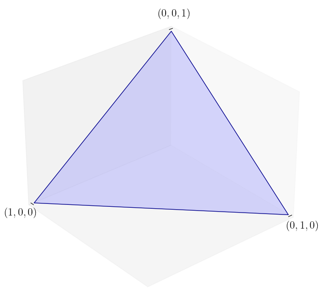
The unit simplex in \(\mathbb{R}^3\)#
Here we define a function for plotting the unit simplex.
def unit_simplex(angle):

    fig = plt.figure(figsize=(10, 8))
    ax = fig.add_subplot(111, projection='3d')

    vtx = [[0, 0, 1],
           [0, 1, 0],
           [1, 0, 0]]

    tri = Poly3DCollection([vtx], color='darkblue', alpha=0.3)
    tri.set_facecolor([0.5, 0.5, 1])
    ax.add_collection3d(tri)

    ax.set(xlim=(0, 1), ylim=(0, 1), zlim=(0, 1),
           xticks=(1,), yticks=(1,), zticks=(1,))

    ax.set_xticklabels(['$(1, 0, 0)$'], fontsize=16)
    ax.set_yticklabels([f'$(0, 1, 0)$'], fontsize=16)
    ax.set_zticklabels([f'$(0, 0, 1)$'], fontsize=16)

    ax.xaxis.majorTicks[0].set_pad(15)
    ax.yaxis.majorTicks[0].set_pad(15)
    ax.zaxis.majorTicks[0].set_pad(35)

    ax.view_init(30, angle)

    # Move axis to origin
    ax.xaxis._axinfo['juggled'] = (0, 0, 0)
    ax.yaxis._axinfo['juggled'] = (1, 1, 1)
    ax.zaxis._axinfo['juggled'] = (2, 2, 0)

    ax.grid(False)

    return ax
We can now produce the plot.
unit_simplex(50)
if export_figures:
    plt.savefig("figures/simplex_1.pdf")
plt.show()
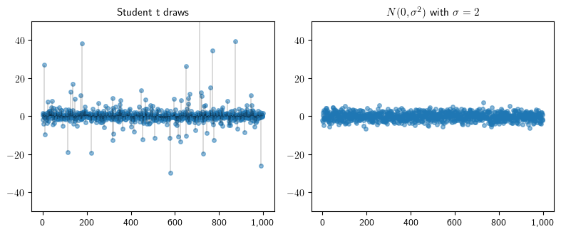
Independent draws from Student’s t and Normal distributions#
Here we illustrate the occurrence of “extreme” events in heavy tailed distributions. We start by generating 1,000 samples from a normal distribution and a Student’s t distribution.
from scipy.stats import t
n = 1000
np.random.seed(123)

s = 2
n_data = np.random.randn(n) * s

t_dist = t(df=1.5)
t_data = t_dist.rvs(n)
When we plot our samples, we see the Student’s t distribution frequently generates samples many standard deviations from the mean.
fig, axes = plt.subplots(1, 2, figsize=(8, 3.4))

for ax in axes:
    ax.set_ylim((-50, 50))
    ax.plot((0, n), (0, 0), 'k-', lw=0.3)

ax = axes[0]
ax.plot(list(range(n)), t_data, linestyle='', marker='o', alpha=0.5, ms=4)
ax.vlines(list(range(n)), 0, t_data, 'k', lw=0.2)
ax.get_xaxis().set_major_formatter(
    ticker.FuncFormatter(lambda x, p: format(int(x), ',')))
ax.set_title(f"Student t draws", fontsize=11)

ax = axes[1]
ax.plot(list(range(n)), n_data, linestyle='', marker='o', alpha=0.5, ms=4)
ax.vlines(list(range(n)), 0, n_data, lw=0.2)
ax.get_xaxis().set_major_formatter(
    ticker.FuncFormatter(lambda x, p: format(int(x), ',')))
ax.set_title(f"$N(0, \sigma^2)$ with $\sigma = {s}$", fontsize=11)

plt.tight_layout()
if export_figures:
    plt.savefig("figures/heavy_tailed_draws.pdf")
plt.show()
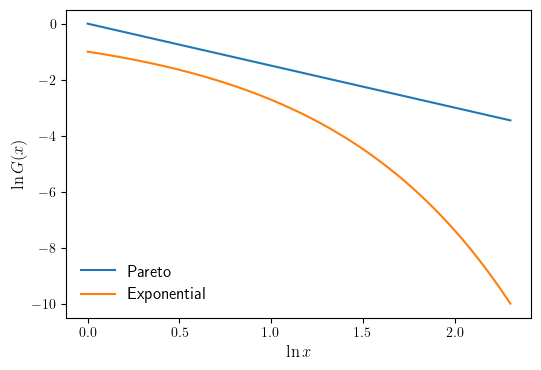
CCDF plots for the Pareto and Exponential distributions#
When the Pareto tail property holds, the CCDF is eventually log linear. Here we illustrates this using a Pareto distribution. For comparison, an exponential distribution is also shown. First we define our domain and the Pareto and Exponential distributions.
x = np.linspace(1, 10, 500)
α = 1.5
def Gp(x):
    return x**(-α)
λ = 1.0
def Ge(x):
    return np.exp(-λ * x)
We then plot our distribution on a log-log scale.
fig, ax = plt.subplots(figsize=default_figsize)

ax.plot(np.log(x), np.log(Gp(x)), label="Pareto")
ax.plot(np.log(x), np.log(Ge(x)), label="Exponential")

ax.legend(fontsize=12, frameon=False, loc="lower left")
ax.set_xlabel("$\ln x$", fontsize=12)
ax.set_ylabel("$\ln G(x)$", fontsize=12)

if export_figures:
    plt.savefig("figures/ccdf_comparison_1.pdf")
plt.show()
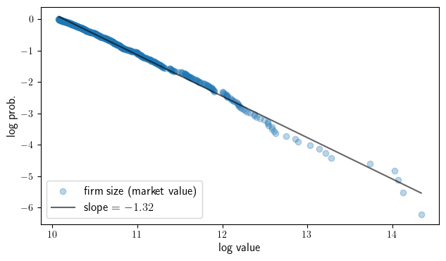
Empirical CCDF plots for largest firms (Forbes)#
Here we show that the distribution of firm sizes has a Pareto tail. We start
by loading the forbes_global_2000 dataset.
dfff = ch1_data['forbes_global_2000']
We calculate values of the empirical CCDF.
data = np.asarray(dfff['Market Value'])[0:500]
y_vals = np.empty_like(data, dtype='float64')
n = len(data)
for i, d in enumerate(data):
    # record fraction of sample above d
    y_vals[i] = np.sum(data >= d) / n
Now we fit a linear trend line (on the log-log scale).
x, y = np.log(data), np.log(y_vals)
results = sm.OLS(y, sm.add_constant(x)).fit()
b, a = results.params
Finally we produce our plot.
fig, ax = plt.subplots(figsize=(7.3, 4))

ax.scatter(x, y, alpha=0.3, label="firm size (market value)")
ax.plot(x, x * a + b, 'k-', alpha=0.6, label=f"slope = ${a: 1.2f}$")

ax.set_xlabel('log value', fontsize=12)
ax.set_ylabel("log prob.", fontsize=12)
ax.legend(loc='lower left', fontsize=12)

if export_figures:
    plt.savefig("figures/empirical_powerlaw_plots_firms_forbes.pdf")
plt.show()
Graph Theory#
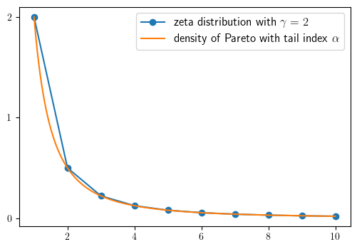
Zeta and Pareto distributions#
We begin by defining the Zeta and Pareto distributions.
γ = 2.0
α = γ - 1
def z(k, c=2.0):
    return c * k**(-γ)

k_grid = np.arange(1, 10+1)
def p(x, c=2.0):
    return c * x**(-γ)

x_grid = np.linspace(1, 10, 200)
Then we can produce our plot
fig, ax = plt.subplots(figsize=default_figsize)
ax.plot(k_grid, z(k_grid), '-o', label='zeta distribution with $\gamma=2$')
ax.plot(x_grid, p(x_grid), label='density of Pareto with tail index $\\alpha$')
ax.legend(fontsize=12)
ax.set_yticks((0, 1, 2))
if export_figures:
    plt.savefig("figures/zeta_1.pdf")
plt.show()
NetworkX digraph plot#
We start by creating a graph object and populating it with edges.
G_p = nx.DiGraph()

edge_list = [
    ('p', 'p'),
    ('m', 'p'), ('m', 'm'), ('m', 'r'),
    ('r', 'p'), ('r', 'm'), ('r', 'r')
]

for e in edge_list:
    u, v = e
    G_p.add_edge(u, v)
Now we can plot our graph.
fig, ax = plt.subplots()
nx.spring_layout(G_p, seed=4)
nx.draw_spring(G_p, ax=ax, node_size=500, with_labels=True,
                 font_weight='bold', arrows=True, alpha=0.8,
                 connectionstyle='arc3,rad=0.25', arrowsize=20)
if export_figures:
    plt.savefig("figures/networkx_basics_1.pdf")
plt.show()
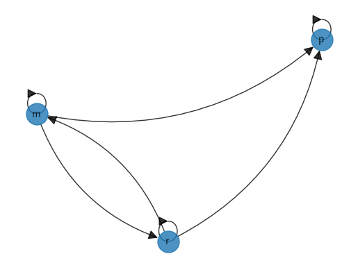
The DiGraph object has methods that calculate in-degree and out-degree of vertices.
G_p.in_degree('p')
3
G_p.out_degree('p')
1
Additionally, the NetworkX package supplies functions for testing
communication and strong connectedness, as well as to compute strongly
connected components.
G = nx.DiGraph()
G.add_edge(1, 1)
G.add_edge(2, 1)
G.add_edge(2, 3)
G.add_edge(3, 2)
list(nx.strongly_connected_components(G))
[{1}, {2, 3}]
Like NetworkX, the Python library quantecon
provides access to some graph-theoretic algorithms.
In the case of QuantEcon’s DiGraph object, an instance is created via the adjacency matrix.
A = ((1, 0, 0),
     (1, 1, 1),
     (1, 1, 1))
A = np.array(A) # Convert to NumPy array
G = qe.DiGraph(A)

G.strongly_connected_components
[array([0]), array([1, 2])]
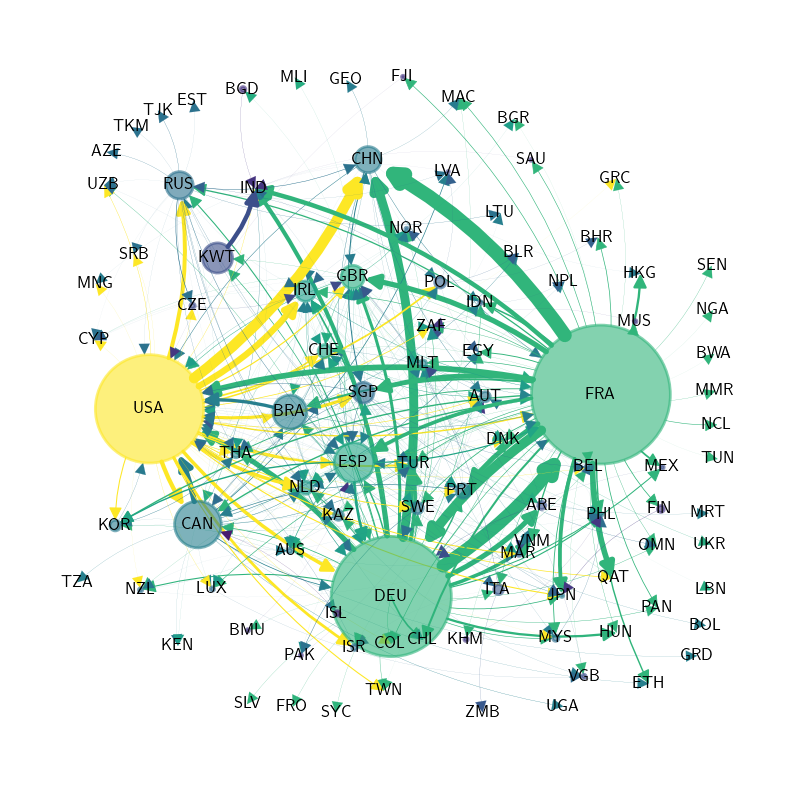
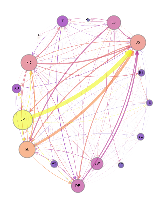
International private credit flows by country#
We begin by loading an adjacency matrix of international private credit flows (in the form of a NumPy array and a list of country labels).
Z = ch1_data["adjacency_matrix"]["Z"]
Z_visual= ch1_data["adjacency_matrix"]["Z_visual"]
countries = ch1_data["adjacency_matrix"]["countries"]
To calculate our graph’s properties, we use hub-based eigenvector centrality as our centrality measure for this plot.
centrality = qbn_io.eigenvector_centrality(Z_visual, authority=False)
Now we convert our graph features to plot features.
node_colors = cm.plasma(qbn_io.to_zero_one_beta(centrality))
Finally we produce the plot.
X = qbn_io.to_zero_one_beta(Z.sum(axis=1))

fig, ax = plt.subplots(figsize=(8, 10))
plt.axis("off")

qbn_plot.plot_graph(Z_visual, X, ax, countries,
           layout_type='spring',
           layout_seed=1234,
           node_size_multiple=3000,
           edge_size_multiple=0.000006,
           tol=0.0,
           node_color_list=node_colors)

if export_figures:
    plt.savefig("figures/financial_network_analysis_visualization.pdf")
plt.show()
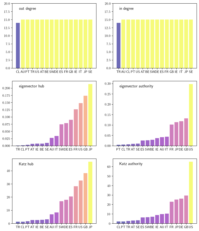
Centrality measures for the credit network#
This figure looks at six different centrality measures.
We begin by defining a function for calculating eigenvector centrality.
Hub-based centrality is calculated by default, although authority-based centrality
can be calculated by setting authority=True.
def eigenvector_centrality(A, k=40, authority=False):
    """
    Computes the dominant eigenvector of A. Assumes A is
    primitive and uses the power method.

    """
    A_temp = A.T if authority else A
    n = len(A_temp)
    r = spec_rad(A_temp)
    e = r**(-k) * (np.linalg.matrix_power(A_temp, k) @ np.ones(n))
    return e / np.sum(e)
Here a similar function is defined for calculating Katz centrality.
def katz_centrality(A, b=1, authority=False):
    """
    Computes the Katz centrality of A, defined as the x solving

    x = 1 + b A x    (1 = vector of ones)

    Assumes that A is square.

    If authority=True, then A is replaced by its transpose.
    """
    n = len(A)
    I = np.identity(n)
    C = I - b * A.T if authority else I - b * A
    return np.linalg.solve(C, np.ones(n))
Now we generate an unweighted version of our matrix to help calculate in-degree and out-degree.
D = qbn_io.build_unweighted_matrix(Z)
We now use the above to calculate the six centrality measures.
outdegree = D.sum(axis=1)
ecentral_hub = eigenvector_centrality(Z, authority=False)
kcentral_hub = katz_centrality(Z, b=1/1_700_000)

indegree = D.sum(axis=0)
ecentral_authority = eigenvector_centrality(Z, authority=True)
kcentral_authority = katz_centrality(Z, b=1/1_700_000, authority=True)
Here we provide a helper function that returns a DataFrame for each measure. The DataFrame is ordered by that measure and contains color information.
def centrality_plot_data(countries, centrality_measures):
    df = pd.DataFrame({'code': countries,
                       'centrality':centrality_measures,
                       'color': qbn_io.colorise_weights(centrality_measures).tolist()
                       })
    return df.sort_values('centrality')
Finally, we plot the various centrality measures.
centrality_measures = [outdegree, indegree,
                       ecentral_hub, ecentral_authority,
                       kcentral_hub, kcentral_authority]

ylabels = ['out degree', 'in degree',
           'eigenvector hub','eigenvector authority',
           'Katz hub', 'Katz authority']

ylims = [(0, 20), (0, 20),
         None, None,
         None, None]


fig, axes = plt.subplots(3, 2, figsize=(10, 12))

axes = axes.flatten()

for i, ax in enumerate(axes):
    df = centrality_plot_data(countries, centrality_measures[i])

    ax.bar('code', 'centrality', data=df, color=df["color"], alpha=0.6)

    patch = mpatches.Patch(color=None, label=ylabels[i], visible=False)
    ax.legend(handles=[patch], fontsize=12, loc="upper left", handlelength=0, frameon=False)

    if ylims[i] is not None:
        ax.set_ylim(ylims[i])

if export_figures:
    plt.savefig("figures/financial_network_analysis_centrality.pdf")
plt.show()
Computing in and out degree distributions#
The in-degree distribution evaluated at \(k\) is the fraction of nodes in a
network that have in-degree \(k\). The in-degree distribution of a NetworkX
DiGraph can be calculated using the code below.
def in_degree_dist(G):
    n = G.number_of_nodes()
    iG = np.array([G.in_degree(v) for v in G.nodes()])
    d = [np.mean(iG == k) for k in range(n+1)]
    return d
The out-degree distribution is defined analogously.
def out_degree_dist(G):
    n = G.number_of_nodes()
    oG = np.array([G.out_degree(v) for v in G.nodes()])
    d = [np.mean(oG == k) for k in range(n+1)]
    return d
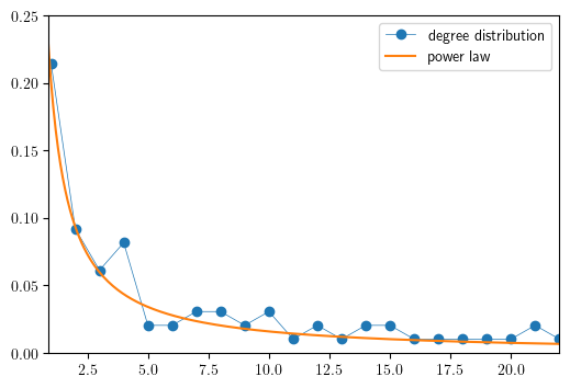
Degree distribution for international aircraft trade#
Here we illustrate that the commercial aircraft international trade network is approximately scale-free by plotting the degree distribution alongside \(f(x)=cx-\gamma\) with \(c=0.2\) and \(\gamma=1.1\).
In this calculation of the degree distribution, performed by the NetworkX
function degree_histogram, directions are ignored and the network is treated
as an undirected graph.
def plot_degree_dist(G, ax, loglog=True, label=None):
    "Plot the degree distribution of a graph G on axis ax."
    dd = [x for x in nx.degree_histogram(G) if x > 0]
    dd = np.array(dd) / np.sum(dd)  # normalize
    if loglog:
        ax.loglog(dd, '-o', lw=0.5, label=label)
    else:
        ax.plot(dd, '-o', lw=0.5, label=label)
fig, ax = plt.subplots(figsize=default_figsize)

plot_degree_dist(DG, ax, loglog=False, label='degree distribution')

xg = np.linspace(0.5, 25, 250)
ax.plot(xg, 0.2 * xg**(-1.1), label='power law')
ax.set_xlim(0.9, 22)
ax.set_ylim(0, 0.25)
ax.legend()
if export_figures:
    plt.savefig("figures/commercial_aircraft_2019_2.pdf")
plt.show()
Random graphs#
The code to produce the Erdos-Renyi random graph, used below, applies the
combinations function from the itertools library. The function
combinations(A, k) returns a list of all subsets of \(A\) of size \(k\). For
example:
import itertools
letters = 'a', 'b', 'c'
list(itertools.combinations(letters, 2))
[('a', 'b'), ('a', 'c'), ('b', 'c')]
Below we generate random graphs using the Erdos-Renyi and Barabasi-Albert algorithms. Here, for convenience, we will define a function to plot these graphs.
def plot_random_graph(RG,ax):
    node_pos_dict = nx.spring_layout(RG, k=1.1)

    centrality = nx.degree_centrality(RG)
    node_color_list = qbn_io.colorise_weights(list(centrality.values()))

    edge_color_list = []
    for i in range(n):
        for j in range(n):
            edge_color_list.append(node_color_list[i])

    nx.draw_networkx_nodes(RG,
                           node_pos_dict,
                           node_color=node_color_list,
                           edgecolors='grey',
                           node_size=100,
                           linewidths=2,
                           alpha=0.8,
                           ax=ax)

    nx.draw_networkx_edges(RG,
                           node_pos_dict,
                           edge_color=edge_colors,
                           alpha=0.4,
                           ax=ax)
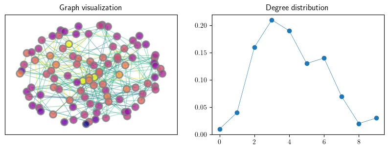
An instance of an Erdos–Renyi random graph#
n = 100
p = 0.05
G_er = qbn_io.erdos_renyi_graph(n, p, seed=1234)
fig, axes = plt.subplots(1, 2, figsize=(10, 3.2))

axes[0].set_title("Graph visualization")
plot_random_graph(G_er,axes[0])

axes[1].set_title("Degree distribution")
plot_degree_dist(G_er, axes[1], loglog=False)

if export_figures:
    plt.savefig("figures/rand_graph_experiments_1.pdf")
plt.show()
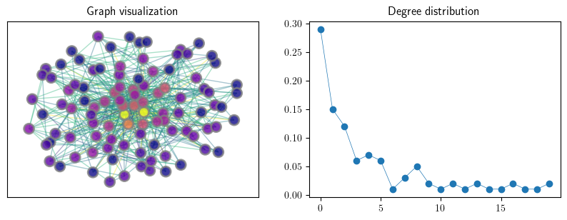
An instance of a preferential attachment random graph#
n = 100
m = 5
G_ba = nx.generators.random_graphs.barabasi_albert_graph(n, m, seed=123)
fig, axes = plt.subplots(1, 2, figsize=(10, 3.2))

axes[0].set_title("Graph visualization")
plot_random_graph(G_ba, axes[0])

axes[1].set_title("Degree distribution")
plot_degree_dist(G_ba, axes[1], loglog=False)

if export_figures:
    plt.savefig("figures/rand_graph_experiments_2.pdf")
plt.show()